Why Gallery Wall Height Matters in a Bedroom with a Daybed
You have a white daybed bedroom and you’re ready to hang a gallery wall above it. Great instinct. That layered art arrangement can make a minimalist space feel personal and lived in. But here’s the thing: one wrong move with the height and the whole room looks… off. Honestly, I’ve walked into so many daybed rooms where the art is floating up near the ceiling like it’s trying to escape. That’s actually the most common mistake with a white daybed bedroom. And it’s fixable in ten minutes with a measuring tape.
The problem starts because we get used to hanging art at general eye level for a standing person. But a daybed invites you to sit. To lounge. To read a book while the afternoon light pours through a big window. The center of your gallery wall needs to line up with your eyes when you are sitting on that mattress, not when you’re standing by the door. This small shift changes everything. Suddenly the artwork feels connected to you, not just to the wall.
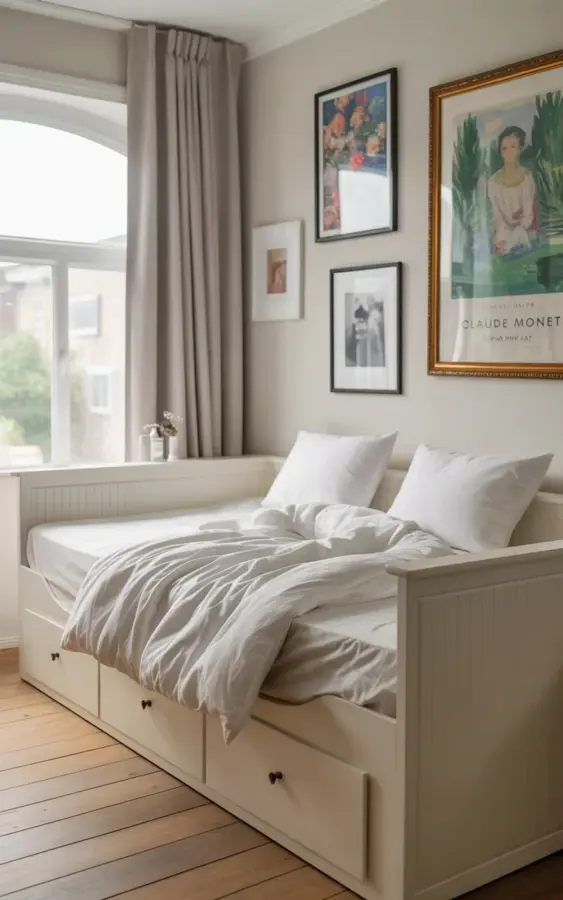
Picture the photo that goes with this article. Crisp white bedding, a rumpled duvet cover with soft folds, a large window on the left with a light gray curtain that drops from ceiling to near-floor height. And on the wall, several framed pieces: a colorful floral in pink and blue tones, a black-and-white photograph, plus a larger framed art print. That gallery wall sits low enough that when you sit on the daybed, the floral print’s center is right at your eye level. Not too high, not too low. It’s intentional. It’s calm.
The One Mistake That Throws Off Your Whole Gallery Wall
Mistake: hanging your gallery wall too high. That’s it. I know it sounds simple, but I’ve seen it ruin more daybed rooms than mismatched pillows or clutter. Let me tell you a quick story. A friend of mine (let’s call her Jen) spent a whole afternoon curating six prints for her white daybed nook. She measured the wall. She leveled everything. But she hung the center of the arrangement at 57 inches from the floor, which is standard gallery height for a standing viewer. When I sat on her daybed, I had to tilt my head back like I was watching a movie in the front row of a steep theater. It felt wrong. Unbalanced. So she lowered everything by about six inches, and suddenly the room breathed.
Look, here’s the reality: a minimalist bedroom (which a white daybed often anchors) relies heavily on proportion and negative space. If your art hovers awkwardly above the furniture, that negative space becomes an accident instead of a design choice. The eye doesn’t know where to rest. You might not be able to name the problem, but you’ll feel it. A little uneasy. A little “something is off.”
So what’s the fix? Easy. Forget the standard 57-inch rule for gallery walls in a daybed room. Use a sitting shortcut instead. Walk over to your daybed, sit down comfortably (feet flat, back against the pillow if you lean), and look straight ahead. That spot on the wall? That’s about where the center of your gallery wall should go. Not an inch higher.
How to Find the Perfect Eye Level for Your Art (Sitting Down)
Ok, so you’re sitting on the daybed. Now what? Grab a friend or a stack of books and a pencil. Here’s the method I use every single time I help someone with a bedroomgallerywall above a daybed:
- Sit naturally on the daybed as if you’re about to read a magazine. Don’t slouch too much, but don’t sit ramrod straight. Just normal sitting posture.
- Hold a small piece of paper or a book at arm’s length and move it up and down until its center aligns with your natural line of sight. Mark that spot lightly on the wall with a pencil (erasable).
- Now stand up. That mark is the center of your entire gallery wall arrangement. Every frame you hang should work around that point. Not the top frame. Not the bottom frame. The center.
I learned this the hard way. My first apartment had a twin daybed with a tiny window, and I hung a single print way too high because I thought “eye level” always meant standing. It looked like the print was in a museum and I was a toddler. (Not gonna lie, I left it that way for two years because I was too lazy to patch the holes. But you can do better than me.)
For a larger gallery wall with multiple pieces, treat the whole cluster as one big rectangle. Find the midpoint of that rectangle and align it with your sitting eye level. That trick works for two frames or for twelve. It never fails.
Choosing Artwork That Complements a Minimalist Bedroom
You’ve got the height right. Now what about the art itself? Since we’re working with a white daybed bedroom (and probably a neutral color palette), the artwork is your main chance to inject personality without clutter. The photo shows exactly the right approach: a mix of a colorful floral in soft pink and blue, a black-and-white photograph, and a larger print. That variety keeps the wall interesting but doesn’t scream for attention.
Here’s a personal opinion, and I’ll say it plainly: please don’t buy a cheap five-piece set from a home goods store that all looks the same. It kills the charm of a daybeddecor scheme. Instead, collect a few pieces that have meaning. That floral could be a reproduction of a painting you saw on vacation. The black-and-white photo could be a street shot you took yourself. Even if you’re on a budget, mix one or two thrifted frames with new prints. The slight imperfections in frame finishes (a scratch here, a slightly different wood tone there) make the arrangement feel like it grew organically, not like it was ordered in bulk.
One more thing about the white daybed itself. The rumpled duvet in the photo is intentional. A perfectly smoothed, hospital-corners bed can feel stiff in a minimalist bedroom. Those soft folds in the fabric absorb some visual noise and soften the room. Pair that with the large gray curtain (which, by the way, hangs floor-to-ceiling to draw the eye upward, a classic designer trick), and the gallery wall at sitting eye level completes the triangle of balance: horizontal from the bed to the window, vertical from the curtain to the floor, and depth from the art to the viewer.
Other Practical Decor Tips for a White Daybed Setup
Let’s zoom out for a second. You’re here because you want a gallerywallmistake-free room, but honestly, the art height is just one piece of the puzzle. A white daybed bedroom works best when a few other elements align. I’ll list the biggest ones I’ve noticed in real homes (including my cat’s favorite napping spot, which is annoyingly my daybed):
- Storage drawers underneath – the daybed in the photo has them, and for good reason. A minimalist room can’t have visible clutter. Use those drawers for extra throw blankets, out-of-season clothes, or even board games. Out of sight, out of mind.
- Lighting layers – a big window is fantastic for daytime. At night, you need a small table lamp or a wall sconce near the daybed. Avoid overhead lights that cast harsh shadows on your gallery wall.
- Pillow count – two or three pillows maximum. More than that and you lose the minimal feel. Keep one lumbar pillow (maybe in a soft texture like linen) and one standard bed pillow. The rest is visual noise.
- Curtain placement – that gray curtain in the photo goes from ceiling to near-floor. It makes the room feel taller and the daybed feel grounded. Don’t stop the curtain a foot above the window frame. Let it drop.
One weird personal detail: I have a small air plant on the windowsill next to my daybed, and it’s the only thing that ever gets dusted regularly because I see it every time I sit down. That’s not a tip, just an observation. Sometimes the little things keep a room feeling alive.
How to Fix a Gallery Wall That Feels Too High (Without Repainting)
What if you’ve already hung your art and it’s too high? Don’t panic, and don’t fill a dozen nail holes just yet. There’s a trick. Take down the entire arrangement and reconfigure it lower by measuring from the top of the daybed backrest (or the top of the mattress if no backrest) to the bottom edge of your lowest frame. You want a gap of about 6 to 10 inches between the top of the daybed and the bottom of the lowest artwork. Not 12. Not 18. Six to ten.
That gap is the sweet spot. It connects the furniture to the art without mashing them together. If your current gallery wall has a 15-inch gap, lower the whole thing by 5 to 9 inches. Yes, you’ll have to patch a few holes. But a tub of spackle costs four dollars, and you can do it while listening to a podcast. Worth it.
Alternatively, if you don’t want to patch holes, use the same lower arrangement but hang new pictures slightly overlapping the old nail positions. I’ve done that in a rental when I wasn’t allowed to make new holes. It looked a little messy up close but from the daybed you couldn’t tell. (Don’t judge me, it was a temporary solution.)
Final Thoughts for Your Daybed Room Makeover
This whole process is about balance. The white daybed, the big window, the gray curtain, the gallery wall at sitting eye level, the rumpled duvet that says “come sit and relax.” That’s what makes a bedroomgallerywall work in a minimalist setting. Not perfection, but intention.
Your turn. Grab a pencil, sit down on your daybed, and mark that spot. Move your frames lower. Let the space feel calm and connected. And if you’re feeling stuck, come back to this article and look at the details of that photo again: the soft pink flower, the black-and-white frame, the light coming through the window. That’s the feeling you’re after. You can create it too.
Save this idea for your own daybed room makeover. I’d love to hear how it goes when you shift that gallery wall down a few inches. Really. Drop me a comment or a pin. Happy decorating.
#whitedaybed #bedroomgallerywall #minimalistbedroom #gallerywallmistake #daybeddecor